
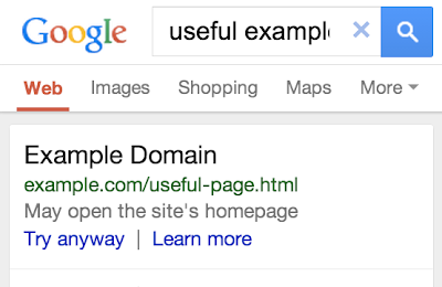
Do you ever think about search engine optimisation for the mobile version of your website? I hope that you do and if you don’t here is another reason for you to start to think about it. Google has announced that it has fixed a bug in its mobile search results so that if a results page will lead mobile users to redirect to the mobile homepage of the website rather than the page listed the user will receive a warning to advise them of this. The warning will appear just below the listing and the user will be given the option to click on the link if they so wish. The fix has been made to the American version of Google and will be rolling out across the world in the next few days.
Why is this fix important for search engine optimisation? Google already takes into account factors such as load speed into their ranking algorithm. Their aim is to provide users with the highest quality results. In an age where users are using their mobile devices more and more it means that site owners need to consider the experience their website provides for mobile users if they want to rank highly on search engines.
Although I use my desktop for my job most of my browsing outside of work is conducted on either my phone or a tablet. The trend towards mobile use is likely to continue. As higher download speeds for mobile users are achieved we will use our mobile devices even more and so it will be essential to provide mobile users with a great user experience.
In order to do this you will need a responsive website. What is a responsive website? This is where the website will display content in an appropriate manner for the device that the website is being viewed on. Let me clarify a common misconception about responsive web design. Many website owners believe that if their website looks the same on a mobile device as it does on the desktop then their website is responsive. This is not the case, mobile browsers will shrink a page so that it fits within the viewport of the device and this leads to users having to zoom in to read text. This does not provide a good experience for the user. A truly responsive design will:
- display text at a size that can be easily read
- it will have multiple versions of images so that the on mobile devices a smaller image is sent in order to reduce download size
- Site navigation will be appropriate for the device, such as having links that are large enough that they can be clicked on easily with a fat finger rather than with the pixel accuracy of a cursor
If you have not considered responsive web design before then perhaps now is the time that you did, not only will it likely help your search engine optimisation efforts but it will provide a better user experience and that should lead to improved conversion rates.